Which menu fits your store?
Most stores follow the same path: build the desktop menu once, turn it into the mobile one, then add a Tab Bar.
The path most stores take
-
Build your Desktop Mega Menu. The biggest menu you’ll make — categories in columns, images, featured products — and Navi+ builds it from the Shopify navigation you already have.
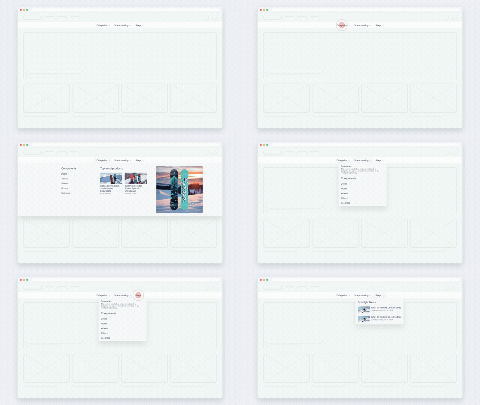
Desktop Mega Menu — the whole catalogue one hover away. -
Turn it into a Mobile Menu. You don’t rebuild anything: Navi+ starts the mobile drawer from the menu you just made, so both screens carry the same navigation. That’s the responsive step — a minute instead of an afternoon.
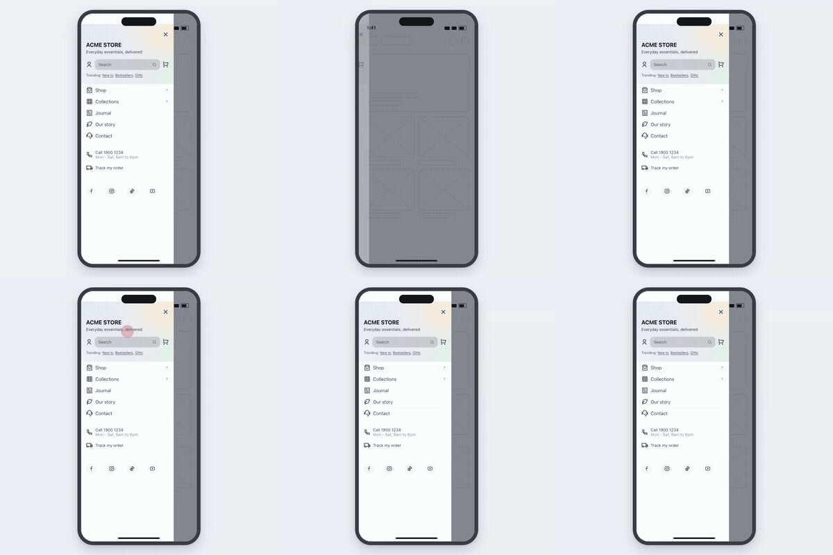
Mobile Menu — the same structure, shaped for a phone. -
Add a Tab Bar. A bar that stays at the bottom of the phone screen puts your key pages one tap away, and lets shoppers open the Mobile Menu without hunting for the ☰ icon. This is the change customers notice first.
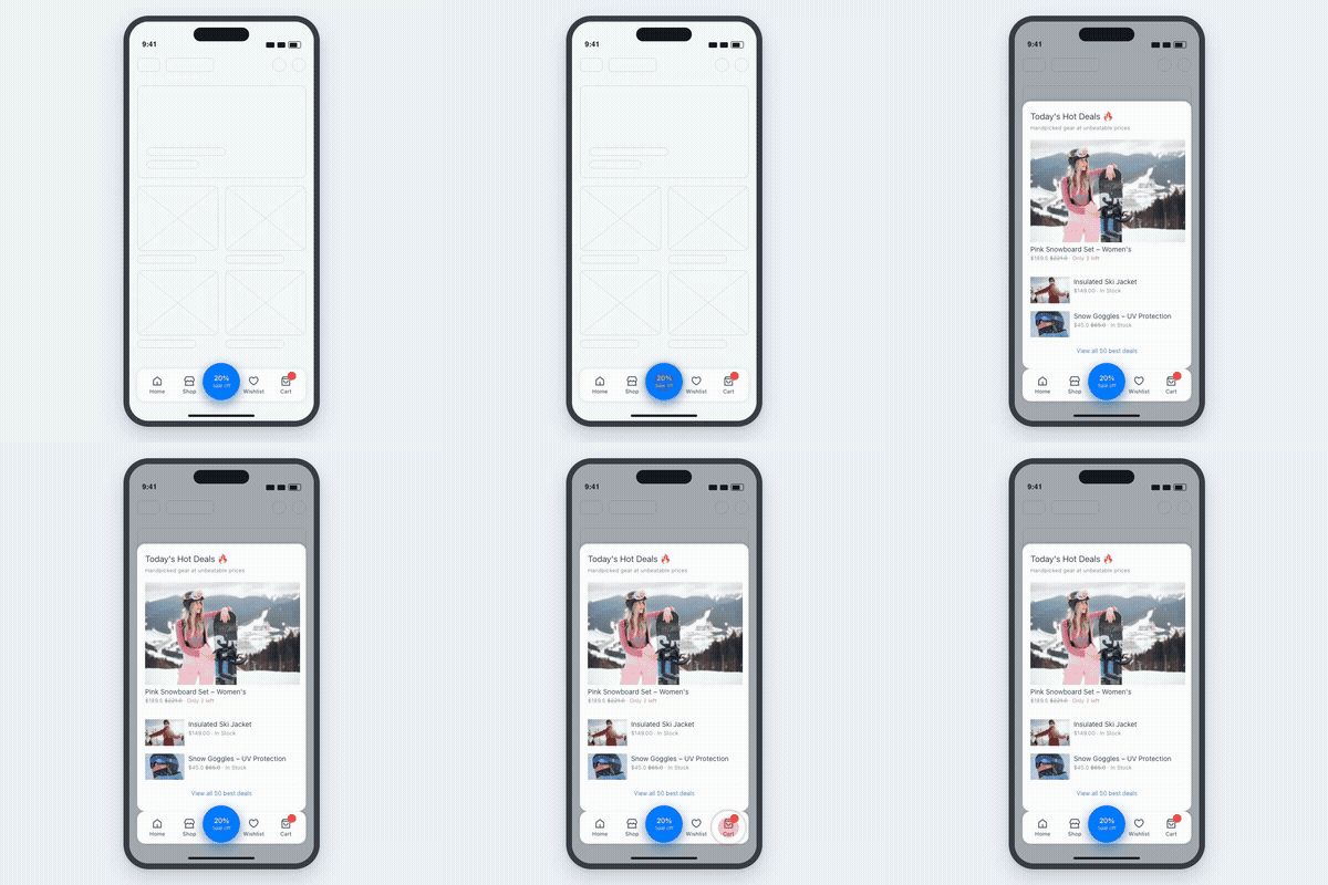
Tab Bar — your store starts behaving like an app.
Do those three and your store is covered on both screens: rich navigation on desktop, the same structure in the drawer, and app-style access on mobile.
Then, depending on your store
| If this sounds like your store | Add |
|---|---|
| Customers land on the home page and don’t know what you sell | Icon Menu — a grid of category tiles inside the page |
| Support links (chat, WhatsApp, store finder) are scattered, or several floating buttons stack up | Floating Button — one button that opens a support panel |
| The drawer isn’t enough on mobile and you want categories visible without opening anything | Mobile Mega Menu — a horizontal bar right under the header |
The six types at a glance
| Type | Where it lives | Also called |
|---|---|---|
| Desktop Mega Menu | Multi-column dropdown under your header | Dropdown Menu, Multi-column Menu |
| Mobile Menu | Slide-out drawer, opened from your ☰ icon | Drawer Menu, Hamburger Menu, Slide Menu |
| Tab Bar | Sticky bar at the bottom of mobile screens | Bottom Navigation, Bottom Tab Bar, Nav Bar |
| Mobile Mega Menu | Horizontal bar right under the header, on mobile | — |
| Icon Menu | A grid of tiles placed in a page section | Grid Menu, Category Tiles |
| Floating Button | Floating button that opens a support panel | FAB, Support Bar, Speed Dial |
Menus are independent — build one, publish it, add another whenever you want.
Next: Your first menu in 5 minutes — step 1 of the path, end to end.
Did this page answer your question?
Need a hand? Chat with us in the app or write to [email protected] — send your store URL and the menu name and we'll look at it with you.