Create a Desktop Mega Menu
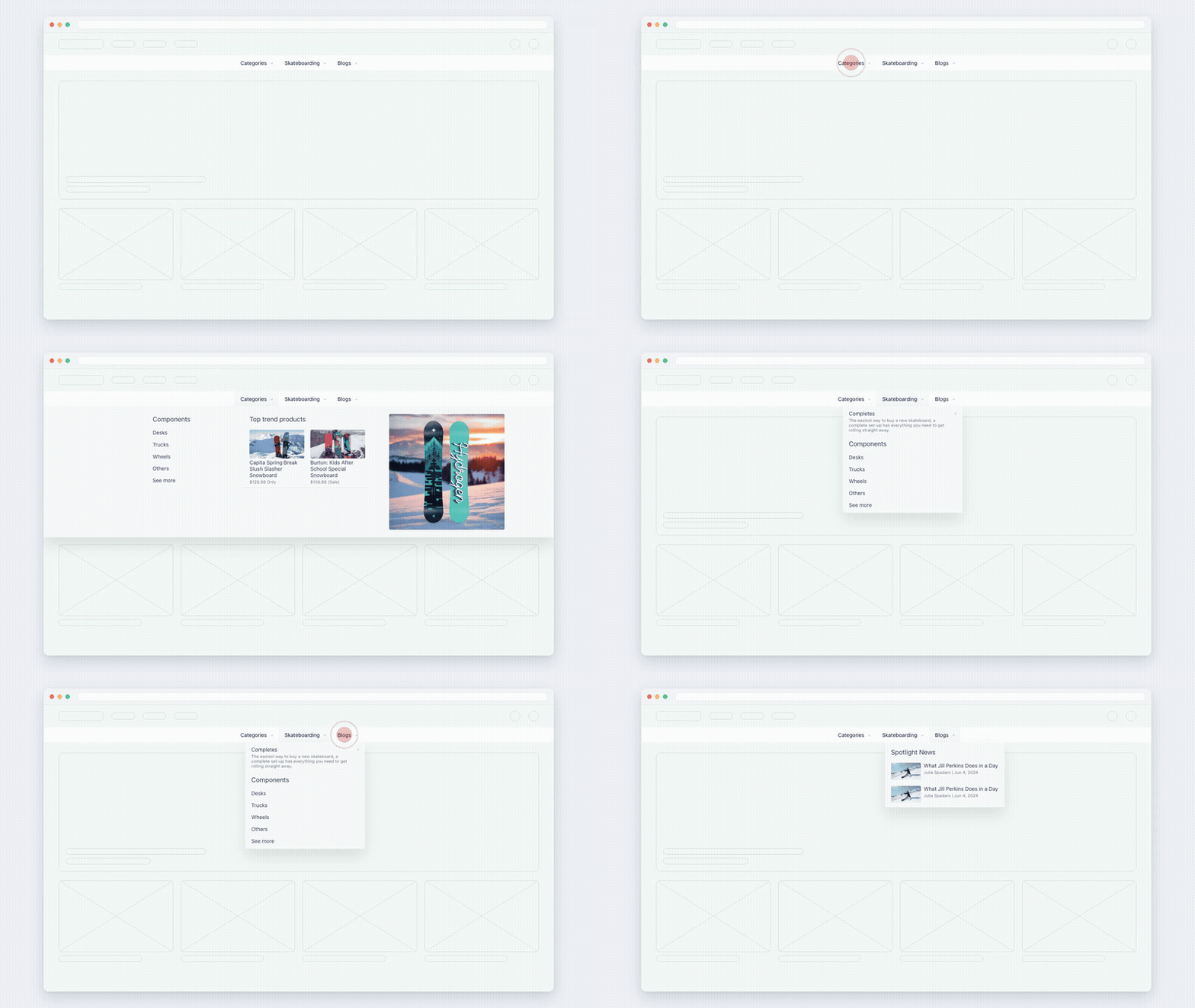
Your whole catalogue one hover away: columns of categories, images, featured products. Build it, place it in your theme — then reuse it on phones without building it twice.
Before you begin
- Navi+ is installed and the app embed is on — Turn on the Navi+ app embed.
- Your Shopify navigation already has a few links. Navi+ builds the menu from them, so you never start with an empty page.
1. Create it
-
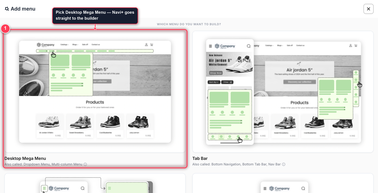
In Navi+, click Add menu, then pick Desktop Mega Menu. This type skips the “how do you want to start?” question and opens the builder straight away — the builder already contains both ways of working: your own links on the left, ready-made designs on the right.
-
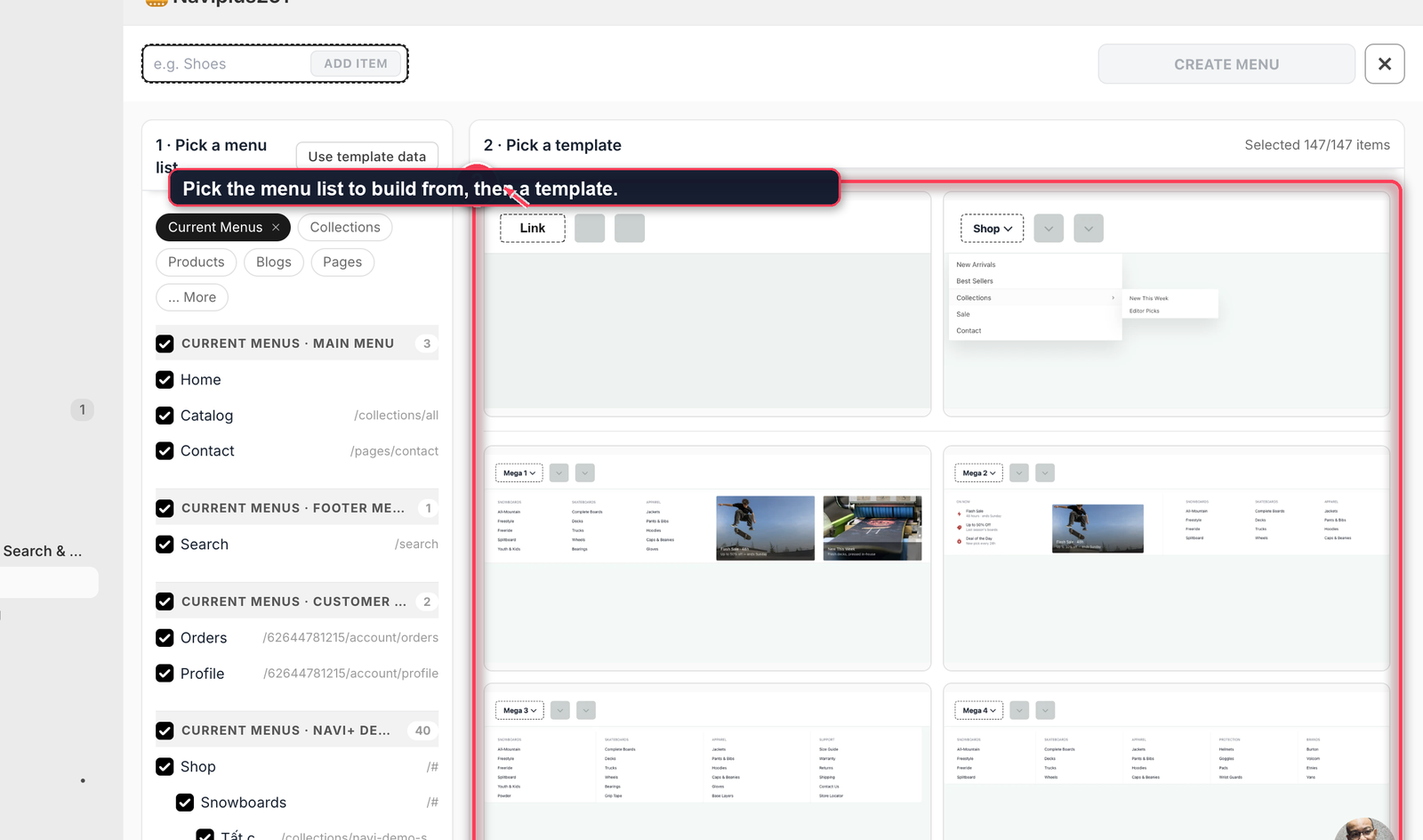
On the left, pick the menu list Navi+ should build from — your Shopify menus, or collections, products, blogs and pages. On the right, pick a template: it decides how one top-level item will look when it opens.
-
Name your first top-level item —
Shoes,Men,Sale— and click Add item. Navi+ fills the panel from the links you picked and shows a Result strip: what went in, and what didn’t fit the template. Keep it, or click Change it. Repeat for each top-level item, then click Create menu.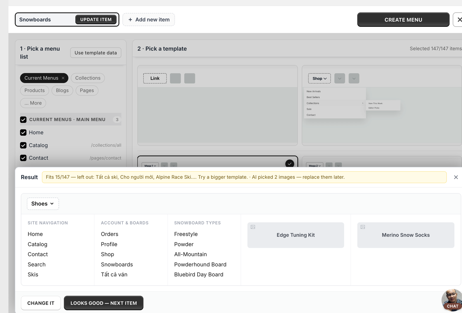
-
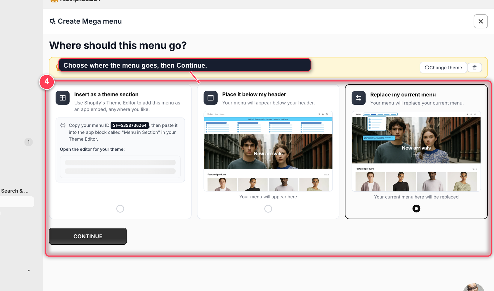
Choose where the menu goes. Three options, and they decide what happens to the menu your theme already has:
- Replace my current menu — the Navi+ menu takes the place of your theme’s navigation, in the same spot in the header. This is the usual choice for a mega menu: one menu, no duplicates.
- Place it below my header — your theme menu stays where it is and the Navi+ menu appears as a second row underneath. Handy while you’re still comparing the two.
- Insert as a theme section — you copy the menu ID, then drop the Menu in Section app block wherever you like in your Theme Editor. Most freedom, but it means a trip into the theme editor.
Navi+ shows a picture of what each one does to your page. Pick one and click Continue.
-
Confirm the colours. Navi+ has measured your header’s background and text colour and shows them on a small preview bar, so you can see the menu in your own colours before it exists. Keep the Recommended pair, or choose Pick my own and set a background and a text colour yourself — if the two would be hard to read together, Navi+ says so. Click Continue and the menu is created; the editor opens on it.
Navi+ reads your Shopify navigation but never changes it. Your theme menu stays exactly as it is.
2. Set it up
-
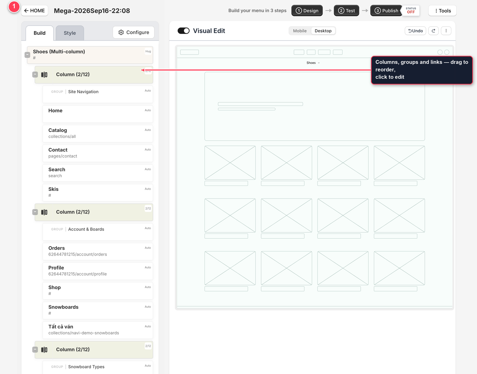
Build shows the menu as a tree: each top-level item holds columns, each column holds groups and links. Drag to reorder, click any row to edit its text, link, image, description or badge — and add banners, cards or a block of your own HTML wherever you want them.
-
Style > Palette makes it match your store in a few clicks: your primary colour plus Generate, or one of the ready-made palettes. Then Main menu and Sub menu open everything else — fonts, text and icon colours, image ratio and corner radius, spacing, background, shadow, animation.
3. Publish
A mega menu lives inside your header, so unlike a Tab Bar it isn’t enough to switch it on — Navi+ also needs to know where in the page it goes. There are two ways.
-
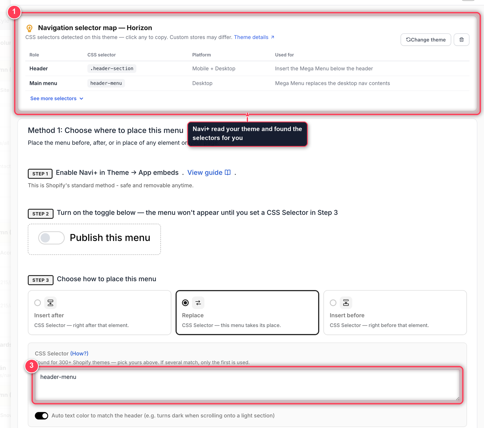
Open Publish. The Navigation selector map at the top already lists the real CSS selectors for your theme: which one is the header, which one is the main menu, and what each is good for. Click one to copy it.
-
Method 1 — CSS selector. Step 1 confirms the app embed. Step 2 turns on Publish this menu (on its own this doesn’t show anything yet). Step 3 is the placement: Insert after, Replace or Insert before, plus the selector you copied — for a mega menu, that’s usually your main menu, so the Navi+ menu takes its place.
-
Method 2 — App block. If your theme supports app blocks, open your theme editor and drag Menu in Section where you want the menu. No CSS selector at all. Method 1 gives you finer control; Method 2 is faster.
Check that it worked
Open your storefront on a laptop and hover a top-level item — the panel opens under your header. Still your old menu? You’re probably looking at a cached page: reload with Cmd + Shift + R (Mac) or Ctrl + F5 (Windows).
Nothing at all? Menu not showing on your store? goes through the five checks in order.
4. Make it work on a phone — without building it twice
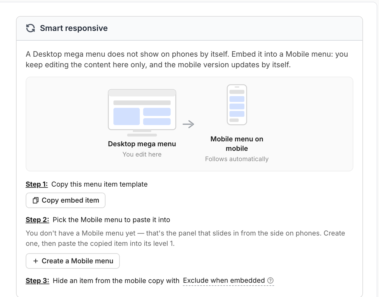
A Desktop Mega Menu doesn’t show on phones at all: the columns have nowhere to go. The mobile version is a different menu — but it doesn’t have to be different work. A Mobile Menu can embed this mega menu instead of copying it, so the content lives in one place: you keep editing the mega menu, and the mobile drawer follows by itself.
Navi+ has a panel for exactly this. Open the mega menu, go to Configure and find Smart responsive.
-
Step 1 — Copy embed item. One click copies a ready-made item that already points at this mega menu.
-
Step 2 — Pick the Mobile Menu to paste it into. Don’t have one yet? Create a Mobile menu right here, then paste the copied item into its level 1. From then on the panel says “This menu already shows on mobile” and names the drawer it lives in.
-
Step 3 — Trim it for mobile, if you want. Some things earn their place on a wide screen but not on a phone — a promo banner, a fourth column of links. Open that item in the mega menu, go to Visibility, and turn on Exclude when embedded: it stays on desktop and disappears from the mobile copy.
What actually happens on the phone
The embedded item disappears when the menu is drawn and is replaced, in place, by the mega menu’s own items — so nothing is nested one level deeper, and everything takes the drawer’s styling rather than the mega menu’s.
Navi+ also unwraps the desktop layout, because columns make no sense on a narrow screen:
- Three, four or five columns all become one column, stacked.
- The column level itself is removed, so a shopper still reaches a link in one tap, not two.
- Column headings used purely to label columns are dropped, and a divider is added between what used to be two columns.
Because it’s a live reference, editing the mega menu updates the drawer immediately — there is no second copy to keep in sync. The only thing to remember: a mega menu that’s embedded somewhere can’t be deleted until you remove the embed item from that Mobile Menu.
Want a drawer with its own structure instead — different links, different order? Build a plain Mobile Menu and skip the embed.
Troubleshoot
It doesn’t appear, even though Publish is on
Publishing alone isn’t enough for this type. Finish one of the two methods above — a CSS selector in step 3, or the app block in your theme editor.
I want to replace only the navigation, not the whole header
Target the Main menu selector from the selector map instead of the header one. Only the nav links are replaced; your logo, search and cart stay where they are.
My theme has no obvious menu selector
Use the selector map card — it covers 300+ Shopify themes. If yours isn’t there, open Debug mode and click the element you want.
Does this slow my page down?
No noticeable impact. The menu is inserted after your page’s critical content, and the app embed adds no requests beyond the menu’s own small data file. More on this in Does Navi+ slow down my store?
Did this page answer your question?
Need a hand? Chat with us in the app or write to [email protected] — send your store URL and the menu name and we'll look at it with you.